


8 Best SaaS Unicorn Performance Agencies to Accelerate Your Path to $1B
In today's digital landscape, mobile devices have become the primary gateway to the online world. With the majority of organic search visits originating from mobile devices in 2023, optimizing your website for mobile search is essential for a healthy site.
We’re a long way from “the year of mobile,” when marketers and web devs rushed to learn and incorporate mobile best practices into owned media.
Yet I still encounter brands who need reminders about initiatives to make mobile a great experience for their uses, and I’ll detail them here.

1. Improve Mobile Site Speed
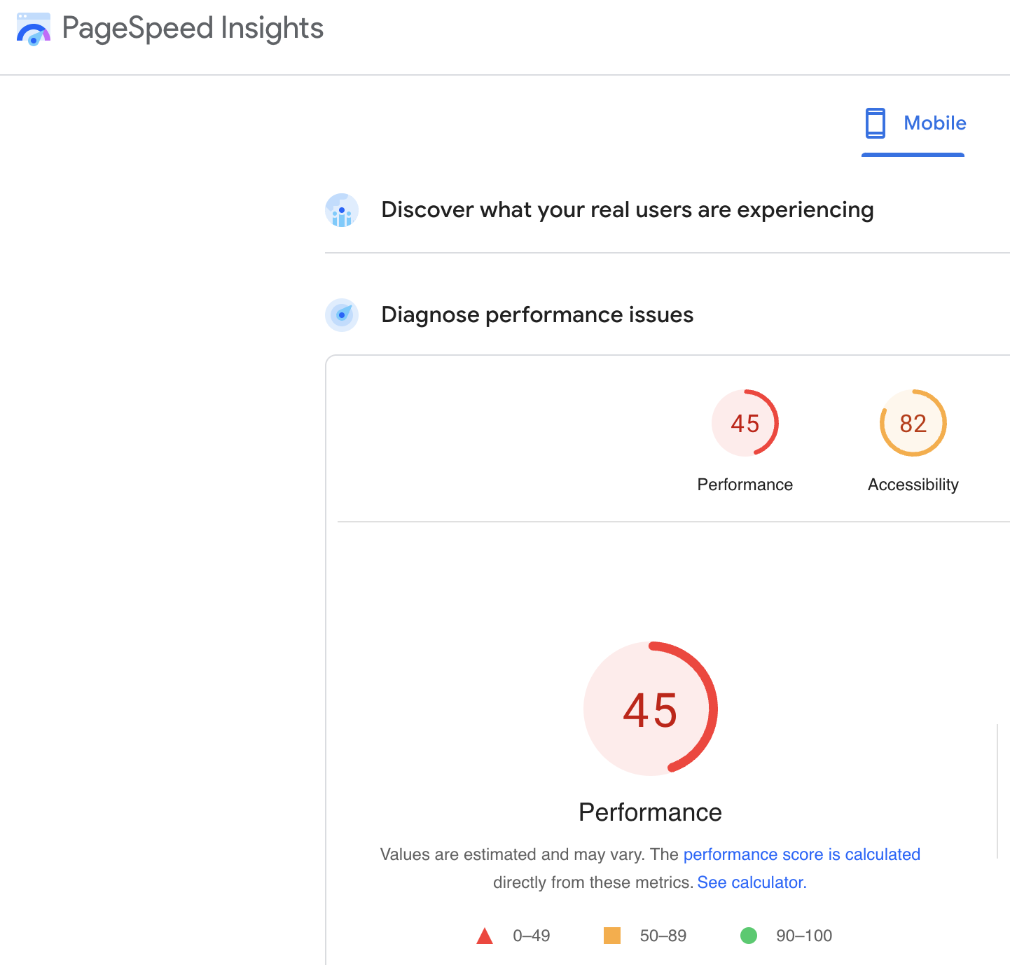
Mobile users are all about speed and convenience. Slow-loading pages can lead to high bounce rates, and Google takes page speed into account when ranking websites.
To enhance user experience and improve your mobile SEO, focus on reducing page load times by compressing images, minimizing lengthy code, and leveraging browser caching to keep your mobile site fast and responsive.
2. Create Mobile-Friendly Content
Your content needs to not only be quality work but also easily digestible on mobile devices. Break up long paragraphs, use concise sentences, and incorporate bullet points and headers to improve readability. Ensure that your images and videos are appropriately sized for mobile screens.
3. Implement Structured Data
Structured data helps search engines understand and crawl your content better. Implementing structured data markup on your mobile website can result in rich snippets, which can improve your visibility and ranking on search engine results pages (SERPs). This added underlying context can make your site more appealing to users and increase click-through rates.
4. Optimize Title Tags & Meta Descriptions
Your title tags and meta descriptions need to be concise yet compelling. Mobile SERPs offer limited space for these elements, so make every character count and keep things succinct. Create titles and descriptions that efficiently summarize your content and encourage users to click through to your site.
5. Compare Mobile Site vs. Desktop Performance
Look at metrics like page load times, bounce rates, and conversion rates for both mobile and desktop. Identify any gaps and ensure that both versions of your website provide an optimal user experience, no matter the device.
Other Tools and Helpful Tips
In addition to these best practices, these tools can help improve your mobile SEO efforts:
Mobile-Friendly Test Tools: Google offers a Mobile-Friendly Test tool that allows you to assess the mobile usability of individual pages. However, that tool will be retired on November 30, 2023, so check out alternatives like Chrome Lighthouse to assess the mobile-friendliness of your site. These tools can help you identify and rectify any mobile user experience issues on your site.
Another way to ensure your site is properly prepared for mobile use is by implementing a responsive design.
Responsive design helps to ensure your website adapts to various screen sizes and devices. Create a seamless and consistent experience for users, regardless of the device they're using. Reach out to our team for help with your mobile SEO strategy.


Emma, who has been in the field of marketing since 2020, joined JDM in 2023 and has since helped clients achieve new bests in organic visibility and engagement. Her ability to conceptualize and produce differentiated content strategies has proven highly effective for growing brand awareness and demand.


