
Jen Shaw - JDM Impressions
Landing pages can single-handedly make or break a marketing campaign. Building a page that blends in with the rest of your site is fine, but if you don’t make a concerted effort to make the landing page conversion friendly you likely won’t get good results. Below are some handy tips to make sure your landing pages are conversion friendly.
General Layout
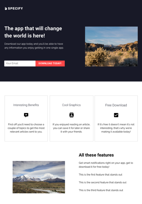
As a general rule you should always have the most important information near the top of your landing page. The likelihood of someone scrolling for more information is very low unless something piques their interest. Make the copy at the top of the page grab their attention! People’s eyes also tend to land most often on the top left of a page (just like in a book!) so put your CTA or form near that area so they immediately understand what they’re expected to do.
Buttons
Make sure your buttons LOOK like buttons. Ovals are not typically used for physical buttons. Use a pill shape, square, or rectangle to ensure it looks like a button. If it makes sense, add a drop shadow of some kind to give it a 3d look. Finally, color isn’t super important for buttons, but make sure it contrasts pretty heavily from the page it’s on. From a design aesthetic perspective a bright neon green button on a dark background would look really ugly, but it would get people to notice (and hopefully click on) it.
CTA
Make your CTA something that stands out! People may actually want to “learn more,” but isn’t that something you’ve seen a million times elsewhere? Make it stand out instead. The CTA on our contact us page is “Fill out the form below to get the ball rolling. We’ll do the rest.” It helps inspire confidence and it’s more interesting.
Social Proof
Testimonials! They make a huge difference. Even if you only feature one quote from a customer social proof is an extremely important addition to a landing page. Be sure to match the quote with the offering as best you can.
Copy
There are a few other copy elements that are extremely important to include on every landing page. First of all, make your copy compelling, direct, and concise. The harder you make it for a consumer to understand what your value proposition is, the more likely they’ll bounce.
If you typically get asked the same questions by consumers, consider adding a FAQ section or copy that preempts those questions.
Be sure to include some copy that explains what the next steps are afterthe user submits the form. People will be reluctant to offer their personal contact information if they don’t know what they’re getting in exchange.
Video
Have some relevant video? Put it up at the top of the page! On a recent survey, 59% of those surveyed mentioned YouTube as their most preferred learning tool. Only 47% choose reading. Lean into that statistic and make it easier for the customer to get the info they need with a video.


